Here’s one from Week Three at Rare Book School.
Summer of 1,000 RBS Posters (Or, A Study in How to Make OK Posters When Given Lo-Res Files)
Permalink
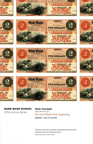
Here’s one from Week Three at Rare Book School.
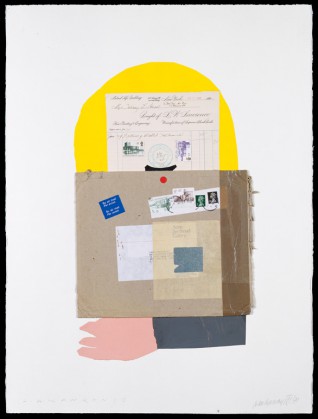
The fifth title in the Kat Ran Essays in Philatelics has just been published: Designed by us in Benton Sans types, Why Stamps? is a new look at the collages of Ivan Chermayeff. Get one for yourself.
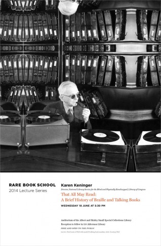
A poster for Week Two at Rare Book School.
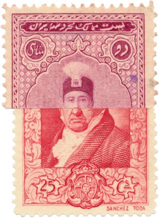
We’ve designed the fourth title in the Kat Ran Essays in Philatelics: Philatelic Atrocities is a fun look book of freaks, oddities, printing, and design.
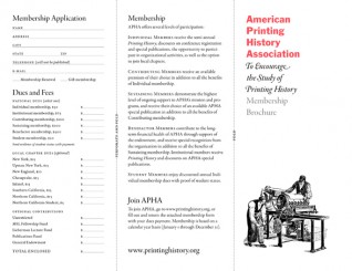
We do a lot of work for the American Printing History Association—including their new site. Here’s their new membership brochure in Franklin Gothic and Garamond Premier Pro.

Did you know we can walk and chew gum at the same time? It’s true. And to prove it we co-opened a new brick-and-mortar store here in Cambridge. You won’t often find the our book design staff there, but you can see our typography all over the place.
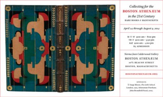
We do more work for the Boston Athenæum than we remember to bill for. Here’s a recent ad for which we forgot to send an invoice. This post is a reminder for our Accounting Department.
Buoyancies by Joseph A. Amato with a drawing by Abigail Rorer. See a few spreads for yourself right here.
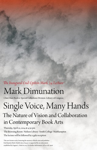
The Inaugural Enid Epstein Mark ’54 Lecture will be presented by Mark Dimunation and remembered forever with this poster designed by us—which can also be adapted for a choral music album cover.
How I Became a Printer: Trevor Winkfield in conversation with Miles Champion. If the photograph of the book in our lap is enticing, then see some spreads here.

Tess Taylor + Shapes + Benton Sans + Red.


