Circle Gets the Square


Permalink

The Differences is the first book by young Patrick Morrissey and the twenty-seventh book we’ve designed for Pressed Wafer. What difference does it make? None, really. Set in Kepler and made to fit in your pocket for reading on the go.

Another Day, Another Barrett


Permalink

Just back from the printer, toward blue peninsula, the second Ed Barrett book we’ve designed. (See the first here.) The insides are essentially the same as the first book, but we’ve traded Helvetica for Benton Sans. (In case you’re keeping track.

We Heart Hartz


Permalink

You love what he did with Juliana’s face, so see almost every single one of Sem Hartz’s stamps here.

You Demanded and We Complied


Permalink

You can’t get enough of his typeface Bona, so see almost every single one of Andrzej Heidrich’s postage stamps here.

Police Blotter


Permalink

Be on the lookout for a criminal with two Altoid tins filled with pennies but without enough typographic sense to take the specimen of Herman Zapf’s Hunt Roman that was sitting on top of those Altoid tins. This criminal broke into our car (which was unlocked) and took our pennies. This criminal also presumably is confident about his or her breath as in our car there was also a brand-new Altoid tin filled with actual Altoids that went untouched—but which we will still probably throw out because, yes, we are just that neurotic.

My Suffolk Downs


Permalink

Boston’s historic Suffolk Downs racetrack has closed down for good. See the book we designed about the people who made it run.

For One Boston


Permalink

A little project for a big cause that we worked on over the summer has just been announced. Pressed Wafer’s For One Boston benefits those injured in the April 15, 2013, Boston Marathon bombings. All monies raised by For One Boston go to Semper Fi’s Boston Marathon Relief Fund and the Heather Abbott Foundation. And if that’s not enough, it contains original works by 150 artists and writers like Haruki Murakami, Paul Auster, Russell Banks, and Fanny Howe.

Book Design and Aprons


Permalink

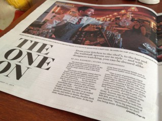
We have the opening and closing quotes in a Boston Globe article about aprons, and our approach to aprons is akin to our approach to books: “We’re big proponents of less being more. Essentially we don’t want people to be afraid of them. If we make them too complicated or precious, they get in the way of them doing their job, which is essentially to keep people clean.” Now, why are we being asked about aprons? Selling linen is one of our hobbies

Back from the Printer: Test Drive Edition


Permalink

We were honored to be the very first to try out (in print) an unreleased family of types by David Jonathan Ross.

The End


Permalink

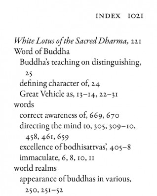
The last page of the 1,040-page Typesetting Dash.

Summer of 1,000 RBS Posters (Or, A Study in How to Make OK Posters When Given Lo-Res Files)


Permalink

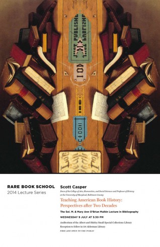
Here’s another one poster for Rare Book School.